Portfolio for Jira redesign
Atlassian, 2017 – 2018Led the year-long redesign of Atlassian's Portfolio for Jira as primary designer — simplifying a product considered too complex, quadrupling monthly active users and earning promotion to Jira Premium.
Problem
Portfolio for Jira was Atlassian's most complex product — and by 2017, it was at risk of losing the enterprise planning market it was built to serve. The product relied on a rigid scheduling algorithm that couldn't be overridden by the user, making it feel like the tool was making decisions for them rather than supporting theirs. PMs described it as impossible to "put what is in my head, into the tool."
The business case was clear: the product needed to find genuine product-market fit or it risked being wound down. I was brought in as the primary designer to lead a fundamental rethink — simplifying the experience enough to attract new users without losing the existing ones who had already built workflows around it.
*In 2020 (after I had left) 'Portfolio for Jira' was rebranded to 'Advanced Roadmaps' and was made part of Jira Premium.
Top constraints
Several tensions shaped every major decision I made on this project:
- Any change too drastic risked losing the existing user base who had built workflows around the product.
- The product needed to maintain data compatibility with its Cloud offering, giving customers a safe migration path.
- We were simultaneously adopting a new front-end technology stack (React), which affected what was feasible sprint-to-sprint.
- The team started with 2 product managers, myself as the sole designer, and 5 developers — growing to approximately 12 developers as we demonstrated early progress.
- Backwards compatibility with the previous generation of the tool was non-negotiable.
Process
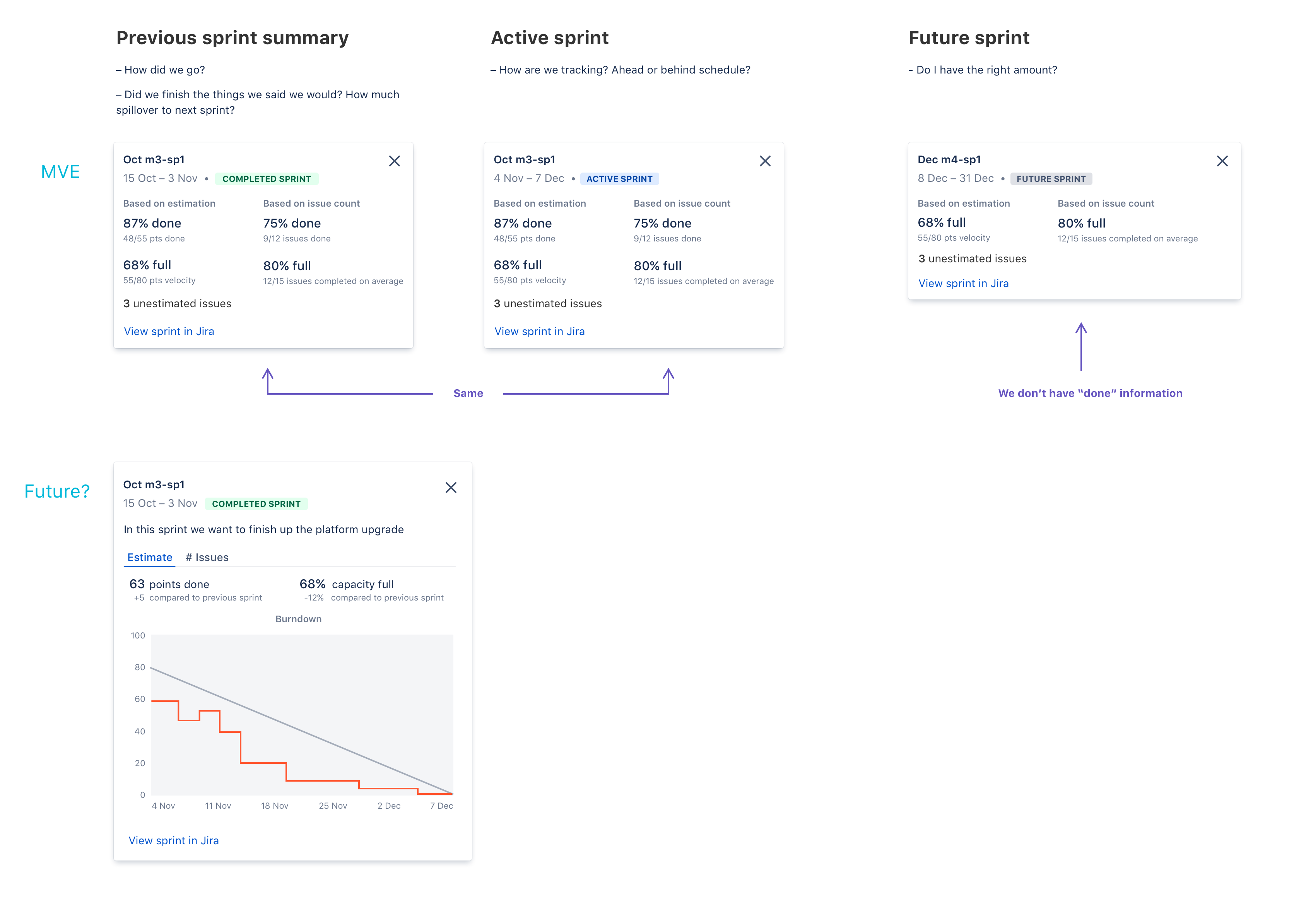
Now that we had understood why exactly users were struggling with the product, I wanted to make sure we knew exactly how product managers went about planning their roadmap today.
From this and other research, I formed an end-to-end user journey represented the typical product manager. With this in mind, I started to work through the flow in a low fidelity. These are just a few key screens that explore basic hierarchy and structure of the page.
Those initial interviewees were brought back to give feedback on the lo-fi end-to-end journey. Over the course of many rounds of feedback, I increased the fidelity and polished both the overall flow, as well as designing how smaller tasks would behave.
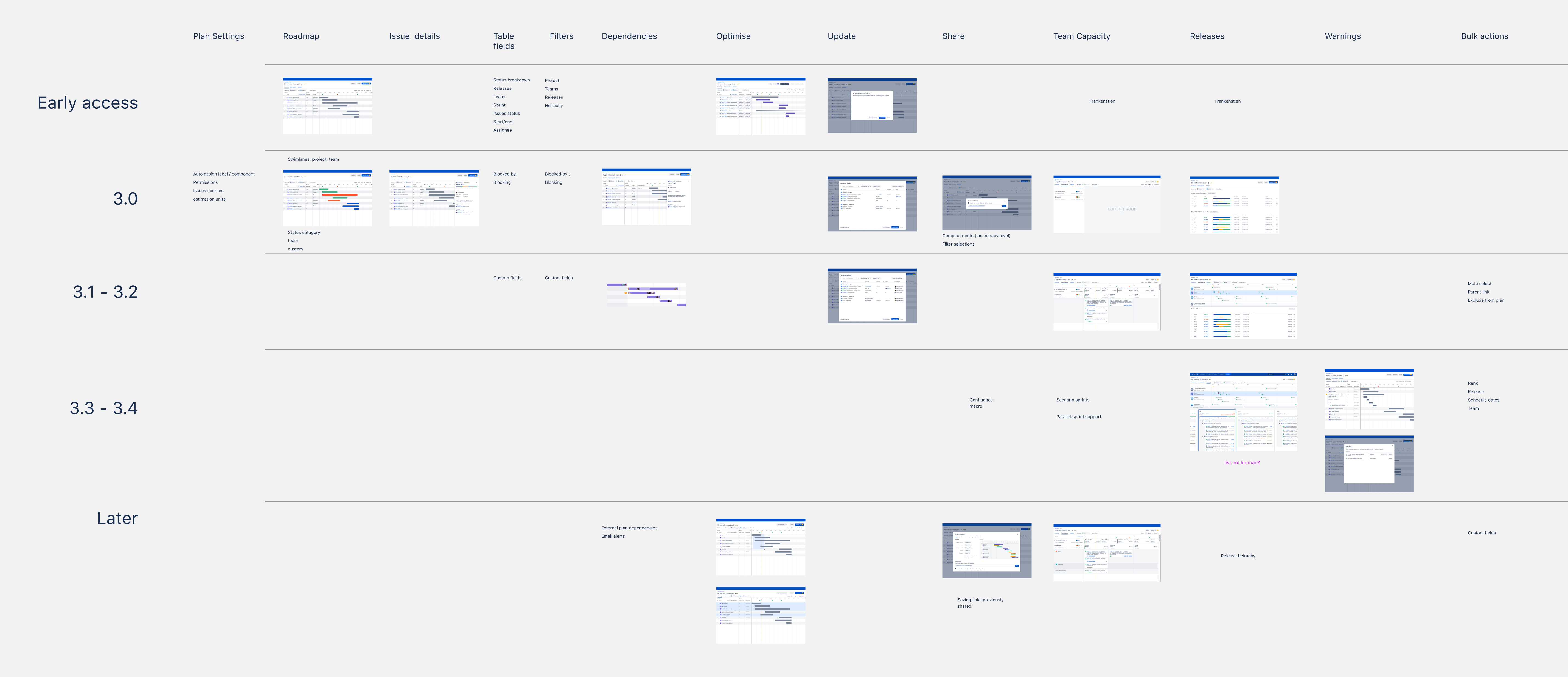
This project would end up spanning over a year from initial kickoff to launching to customers, so I will only include some of the most interesting or relevant parts of the process here.
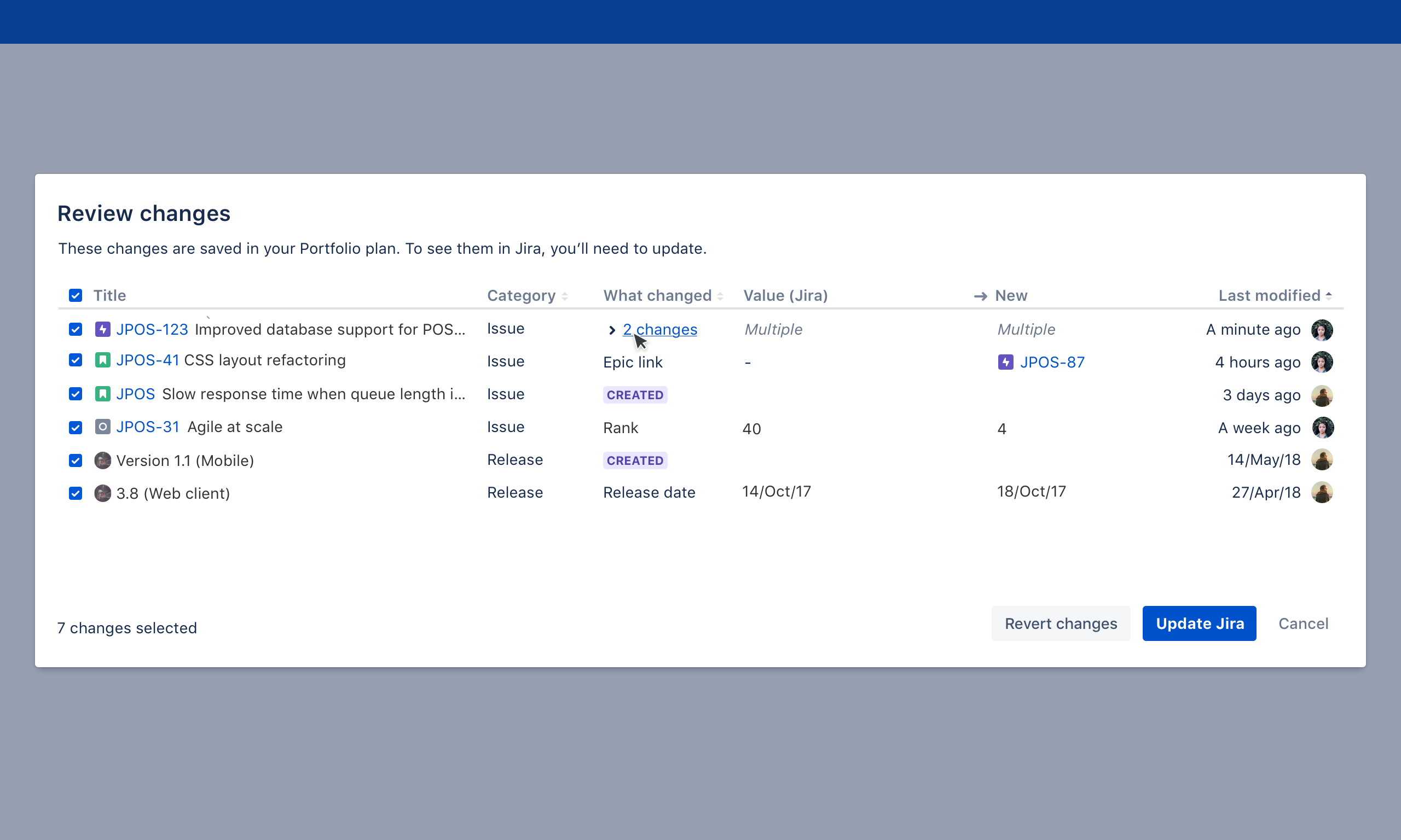
Creating a customer guild for this change ended up being one of the most helpful and important parts for setting us up for success. This was a small invite-only group of a mix of existing and prospective customers who gave regular early feedback on the development of the new version of the tool. 8-10 customers were recruited for this and represented a range of industries, maturity, and familiarity with the existing tool. In an ideal case we could attract new customers without alienating existing ones.
Both large strategic decisions and smaller feature level problems were brought to the customer guild. A common way this might play out would be:
- Initial discovery and enquiries with guild + other users to learn about a problem (e.g. How do you go about socialising roadmaps at your workplace?)
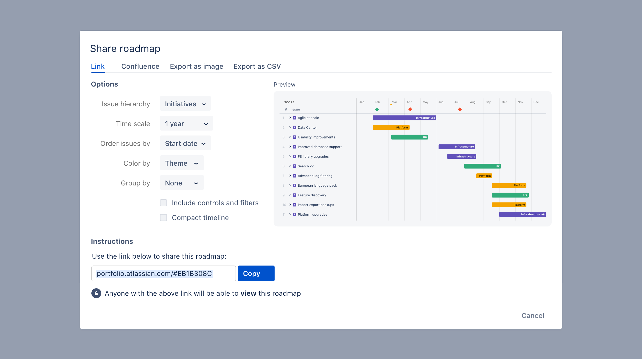
- After turning those research notes into insights, I would then create initial design concepts for solving a certain flow or task. (E.g. a share roadmap flow where you can embed the result in a slide show)
- A protototype or low-fidelity mock would then be brought back to the guild to get feedback on whether that would meet their needs and what changes could be made to better suit them.
- I would work with the product managers to prioritise which set of changes would be best overall trade-off. For example, you might get a very specific request from 1 member of the guild because of their unique business, but it might not make sense to include in our product as a whole.
- A refined design would then make its way into a future sprint or milestone. Once built, those guild customers could then try it out for real in their early-access preview and provide further feedback.
- Depending on if that feature/flow met our goals (quality/impact), we could then move on to the next thing. If it wasn't working for the guild customers, it would be a signal that it'd be unlikely to work at full public launch too.
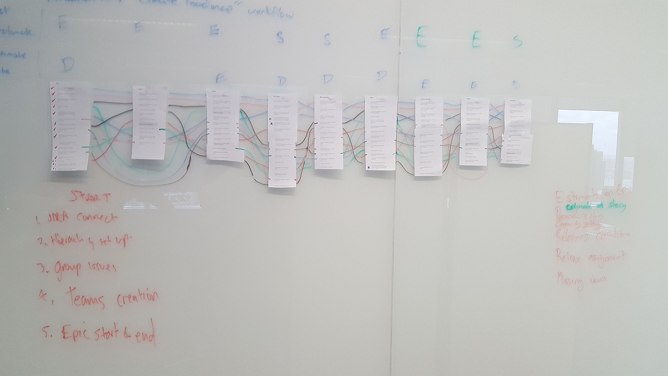
During this phase I would create, print out and put up in our working area these customer sentiment cards. By the end hundreds of these were hung up (wish I had a photo!). Here are a few examples of them.
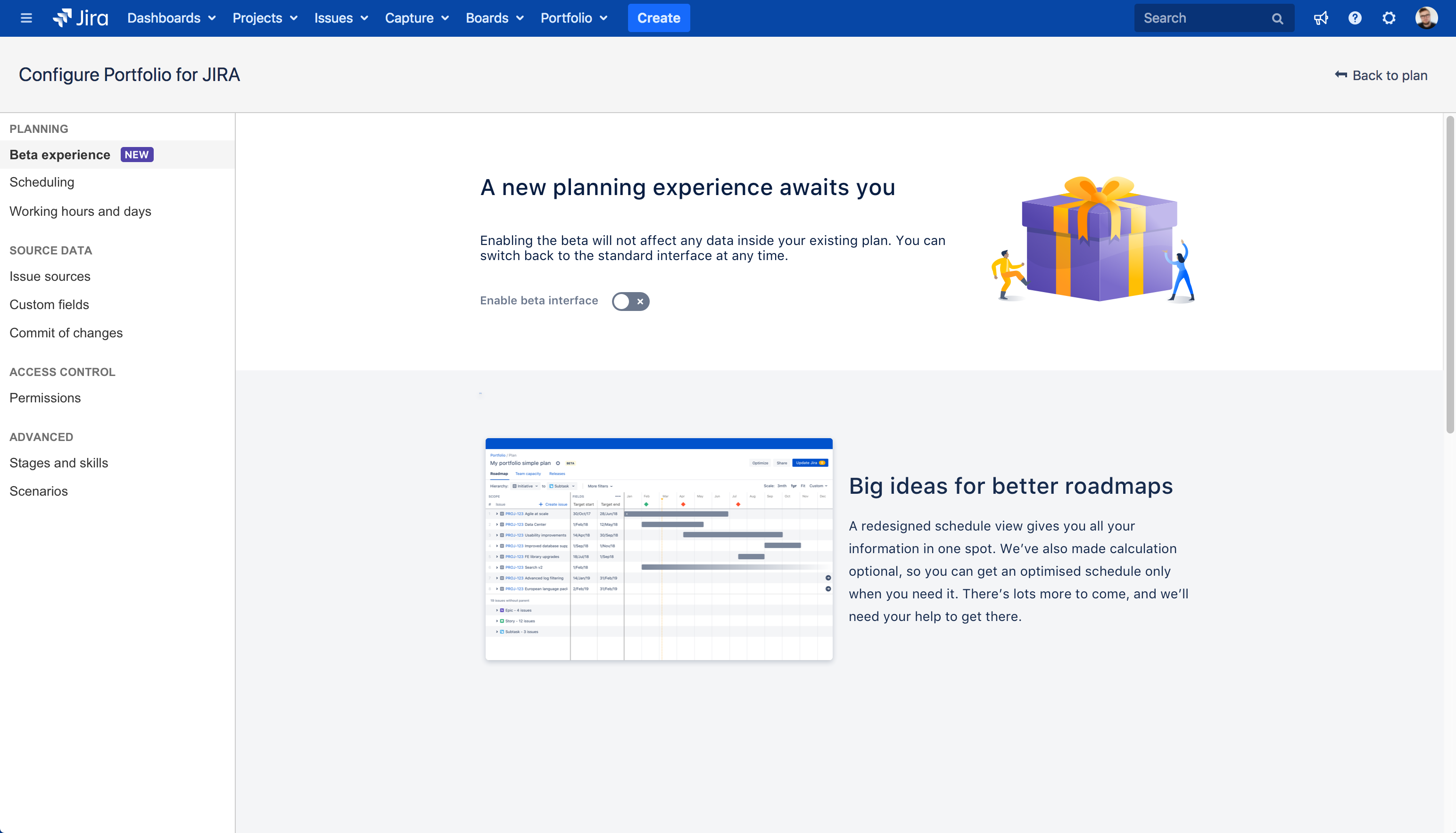
You don't want a major change like this to disrupt existing users who are just trying to get work done. I worked with product management and engineering on defining this rollout strategy:
- A invite only private alpha
- An opt-in public beta
- General availability (any newly created plans would be made in the new interface, but could be toggled off)
- (As of writing has not occurred yet)Future sunsetting of the old interface
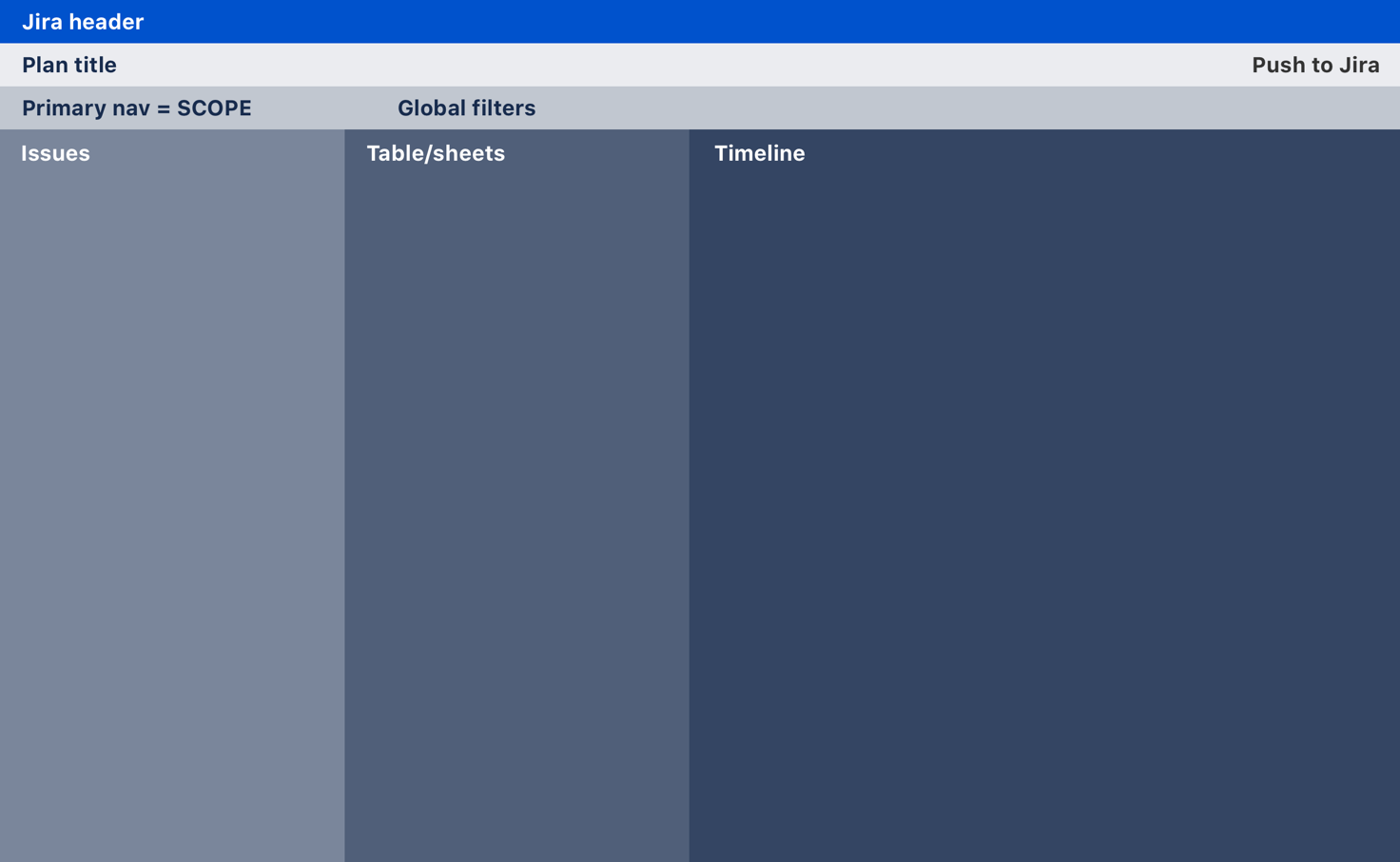
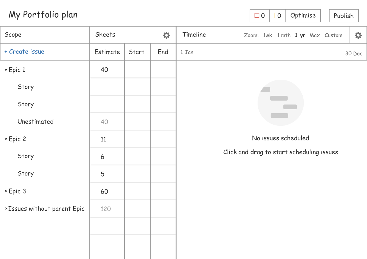
Solution
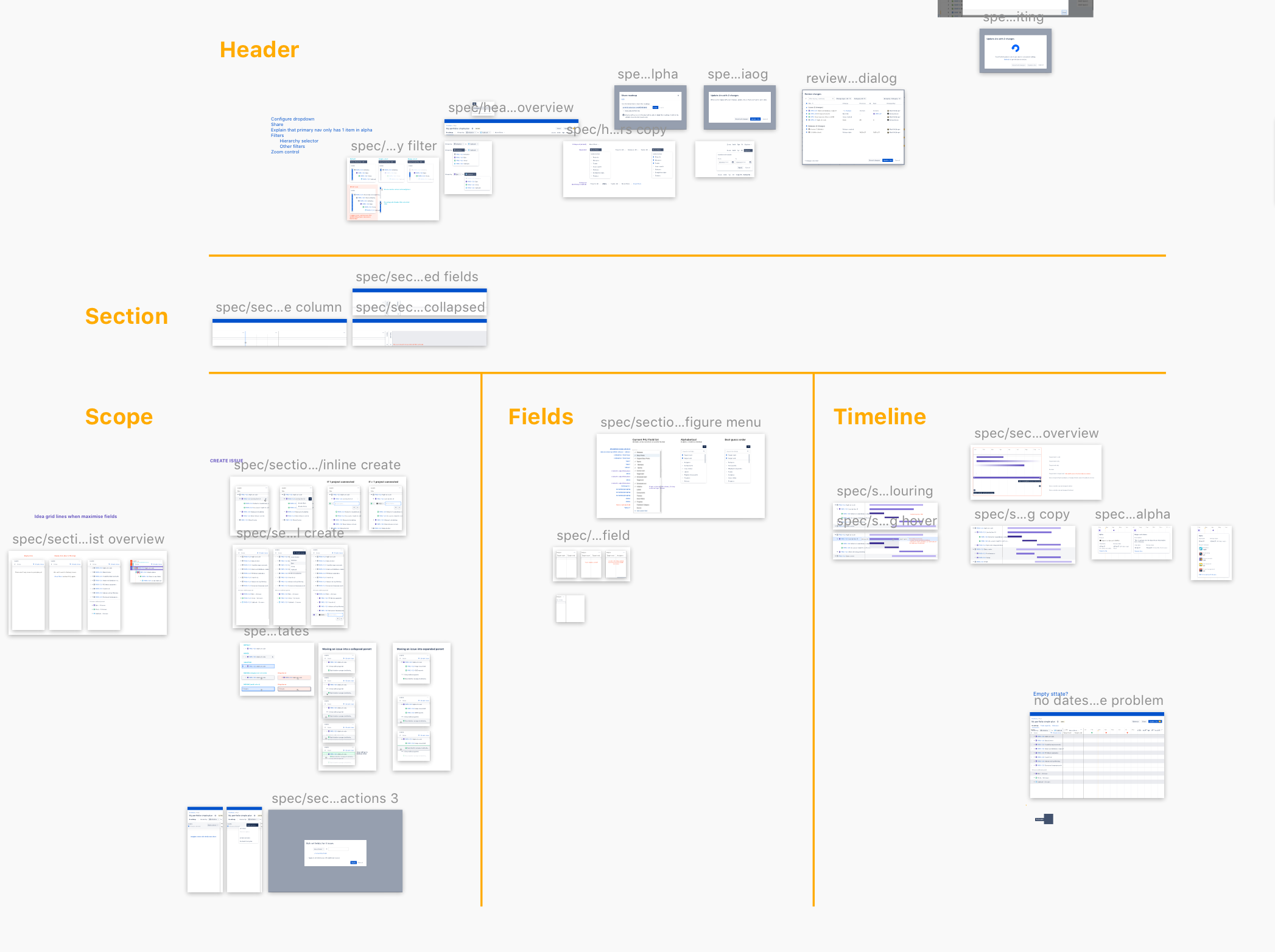
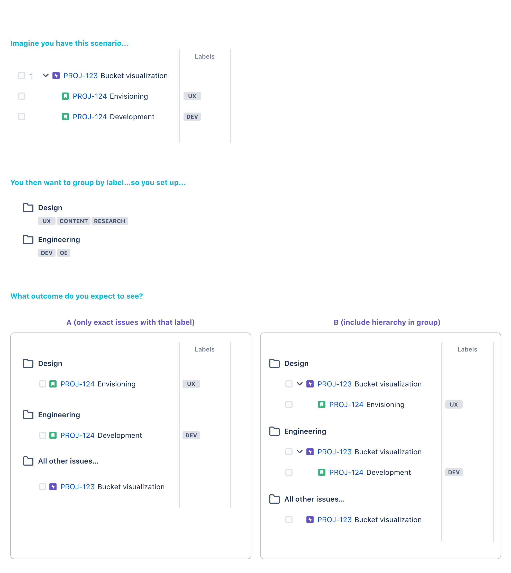
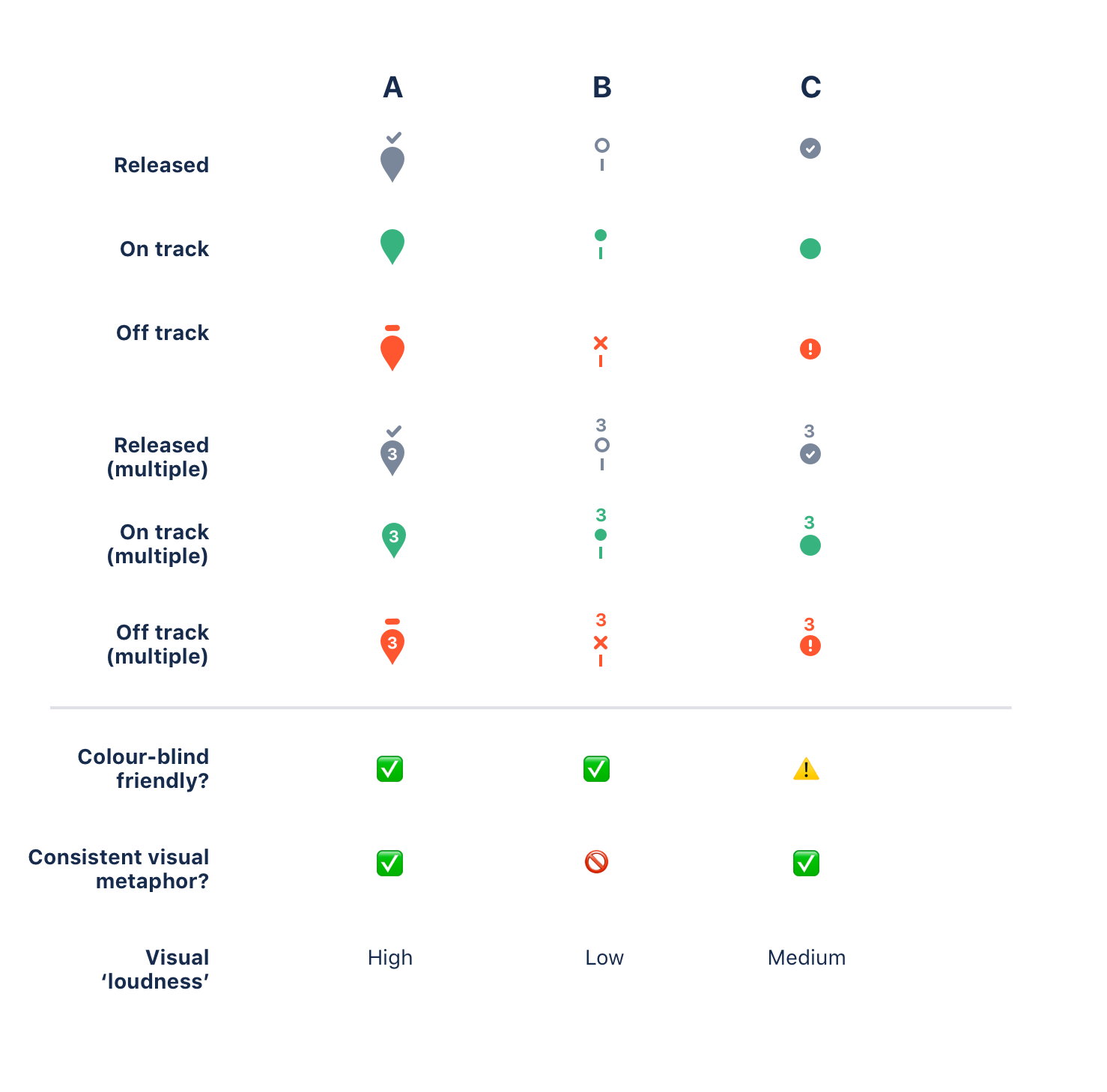
The project spanned over a year and I created 80+ Sketch files in that time. I'll include some of the key screens. To get a sense of the product in motion you can check out a video like this one from Atlassian on YouTube. If you're curious about some of the drag and drop experience see the Interaction design case study .
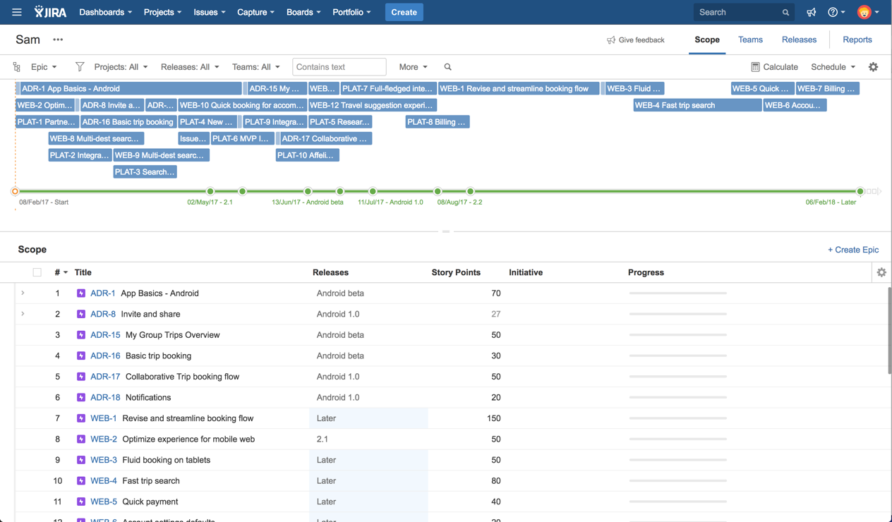
Before
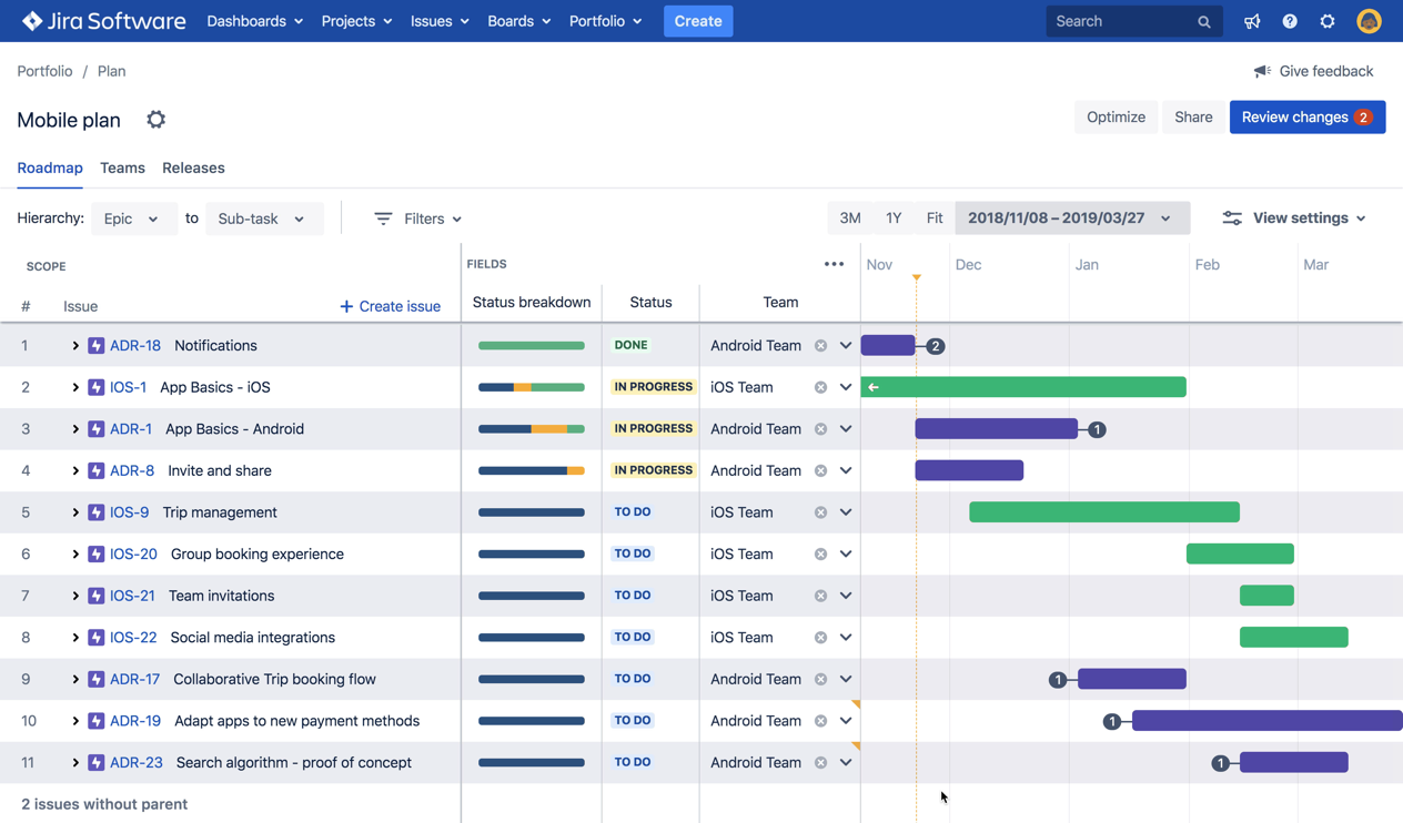
After
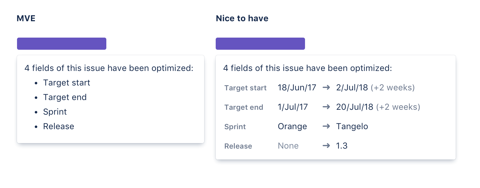
Various assets
Early lo-fi mocks
Success measurement
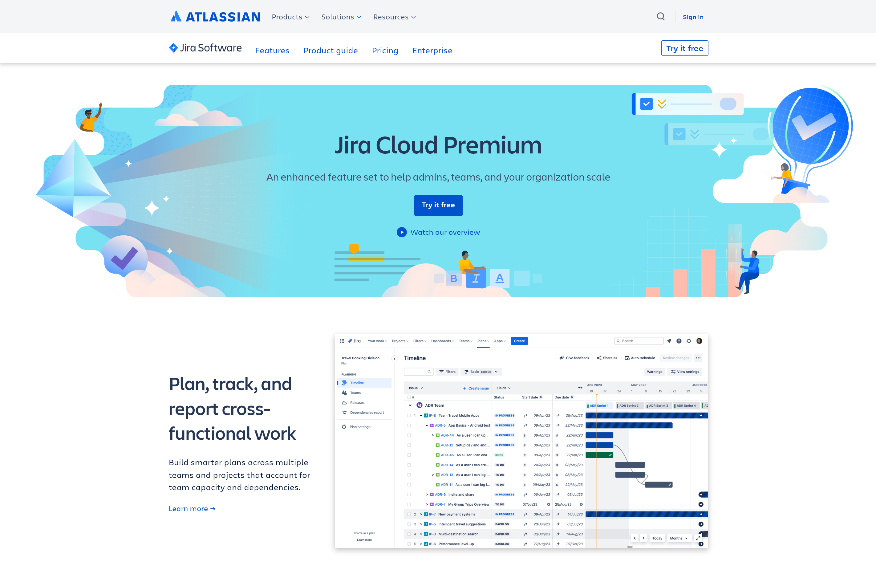
The redesign worked. In the two years following general availability launch, Portfolio for Jira achieved a three-digit percentage increase in monthly active users — significant enough that Atlassian promoted the product from a paid marketplace add-on to a core pillar of Jira Premium, where it remains today as Advanced Roadmaps.
Our core metric throughout the project was usage churn: for someone who uses the product in week one, what percentage return the following week? Driving that number down was the signal we needed that the product was delivering genuine value, not just trial curiosity.
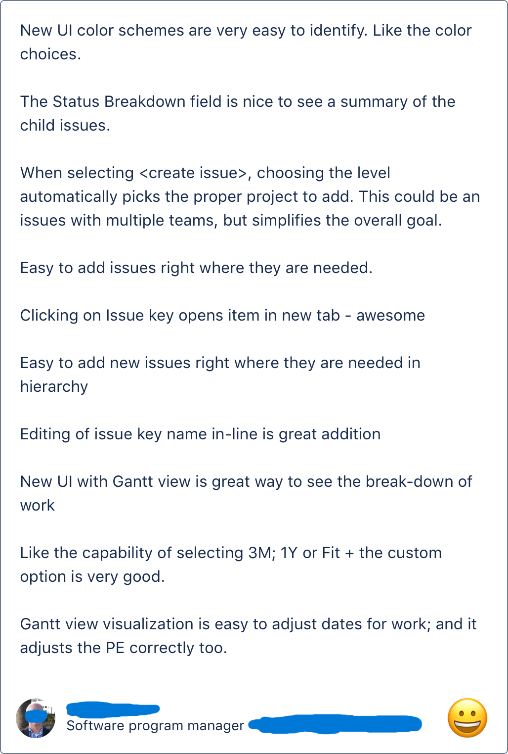
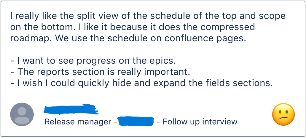
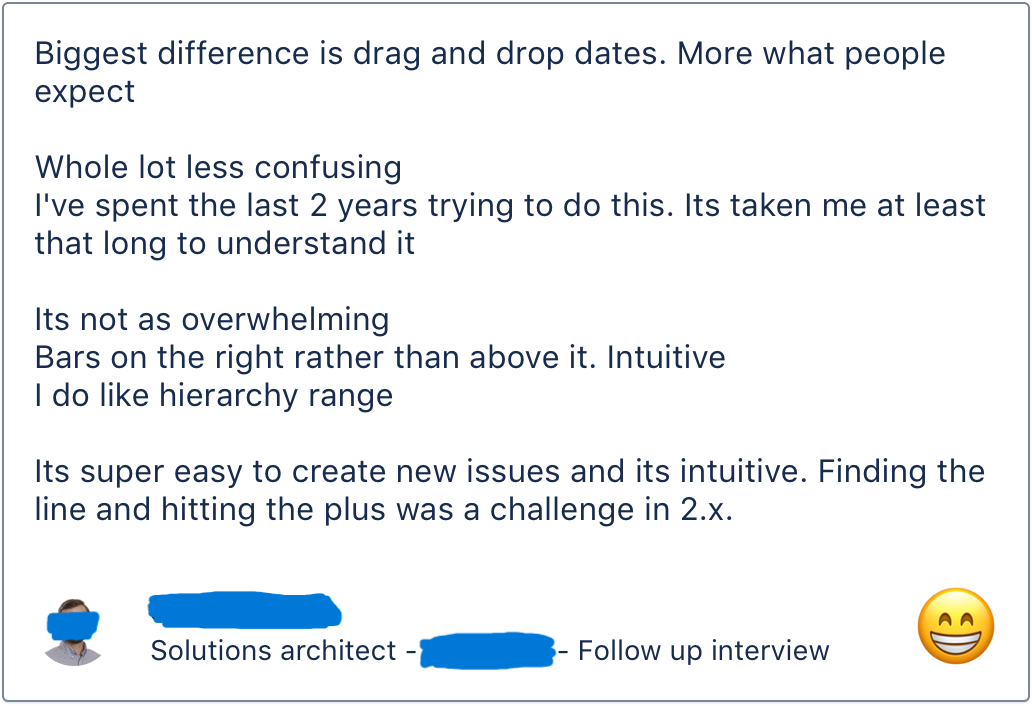
Qualitative feedback during the beta told a clear story. The vast majority of negatives were about missing functionality — the expected early access trade-off — rather than the interaction model itself. A few examples:
- "I like the new cleaner look. The old look has too many options that we will not use or be able to use."
- "This made my night! I am so happy to see the changes to the UI, drag/drop functionality w/ respect to scheduling, better transparency, simplicity, all really important."
- "This is a wonderful improvement to the Portfolio for Jira stack. The WebUI is very user friendly and the create issues on the fly is working a lot better."
- "I like the new planning experience - It greatly simplifies things and find that its the right direction."
- "In the "New Experience" there are less supported types than previously. Already one big issue with Portfolio was that not all the types were supported but it's now gone back"
- "It's really clunky to only have the 3M, 1Y Fit, time bar as a way to navigate the roadmap. There needs to be a horizontal scroll bar that affects the road map only, to allow the user to move freely"